Product UI Iteration
Smart Home
2025.03 - 2025.05 (2 months)
4 Designers
UI/UX Designer
Figma, Jira
Overview
Redesigning the energy-saving experience of a smart thermostat
Energy-saving features in smart thermostats are often invisible and system-driven, leaving users with limited awareness of how their actions contribute to sustainability. While automation improves efficiency, it can reduce users’ sense of control and trust in energy-saving modes.
To address this, I redesigned the Nest Thermostat experience to shift energy saving from a passive system behavior to an actively guided user experience, clarifying ECO settings, visualizing energy impact, and empowering users to confidently balance comfort and efficiency through intuitive interaction and feedback.
Simplify
Interaction Flow
Strengthen
Energy Awareness
Optimize
Visual guidance
Enhance
User Sense of Control
Impact
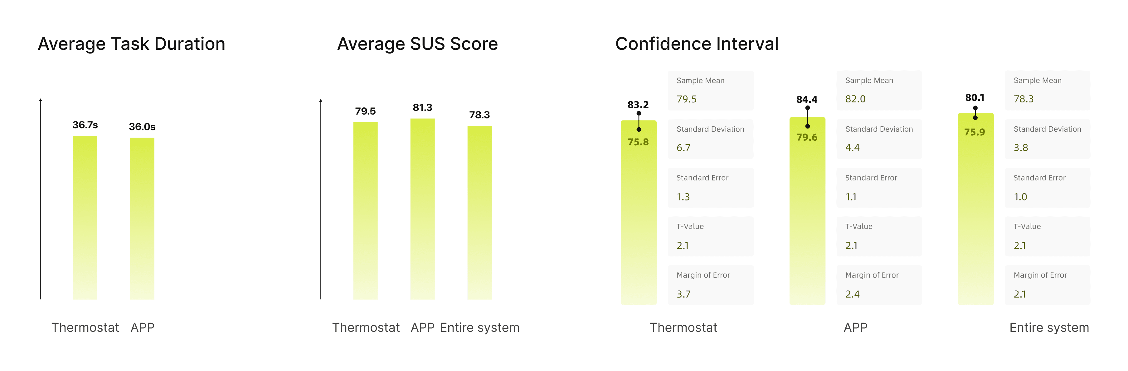
Fostered long-term adoption intent in 85% of users
The redesign improved usability, clarity, and perceived control—resulting in higher task success, stronger mode awareness, and increased user satisfaction. 85% of test participants indicated a willingness to use ECO mode long-term in daily life and to more actively adjust energy-saving settings, demonstrating that the design effectively motivates and supports proactive energy-saving behavior.
85%
User Satisfaction
90%
ECO Mode Feature Usability
85%
Sustained ECO Mode Adoption Intent
Analysis
User Insights
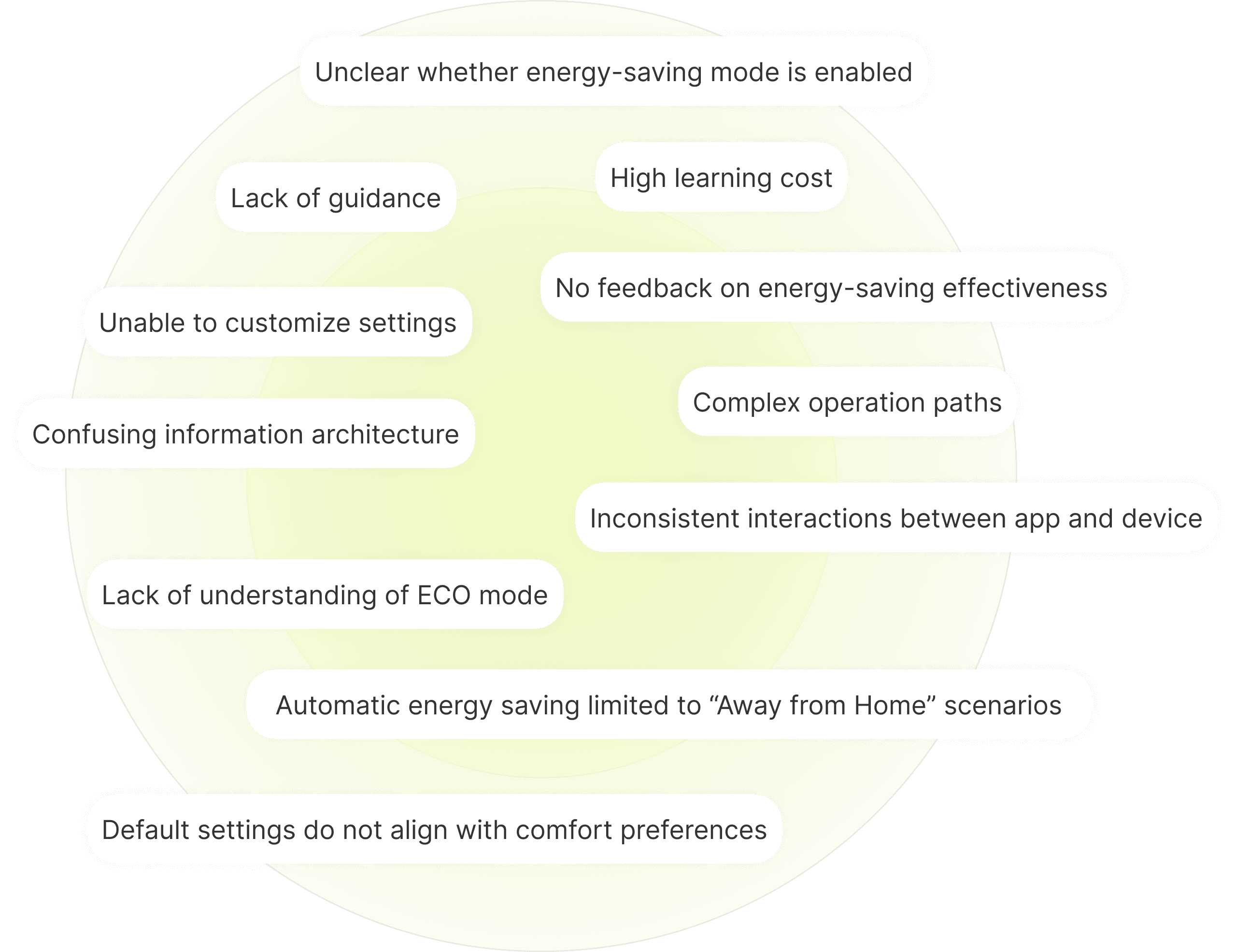
Users want clarity, flexibility, and consistency, not confusing ECO status and fragmented controls
Through interviews and real user feedback from online communities, we found that users’ barriers concentrated in four areas:
Users can’t tell whether energy-saving is currently active.
Default temperature settings don’t fit their needs and are hard to adjust.
The app and device follow different logic, creating a fragmented experience.
The workflow is long and jumpy, making users likely to drop off midway.
Visual Benchmarking
The visual direction prioritizes clarity and friendliness, not visual clutter and complexity
Guided by the keywords “green” and “affordable,” we benchmarked a wide range of digital interfaces and service experiences.
After reviewing these materials, we distilled four key visual traits for ECO mode: a green-led accent palette with warm neutrals, a clean flat style with minimal shadows, rounded and readable typography, and a structured layout with clear grids and generous whitespace.
360+
Images Collected
60+
References Organized
15
Key Inspirations Curated
Design Strategy
Reshapes ECO mode engagement through awareness, control, understanding, and adjustment
Based on our research and analysis, we defined four design levers—awareness, control, understanding, and adjustment—to reshape how ECO mode fits into users’ daily lives.
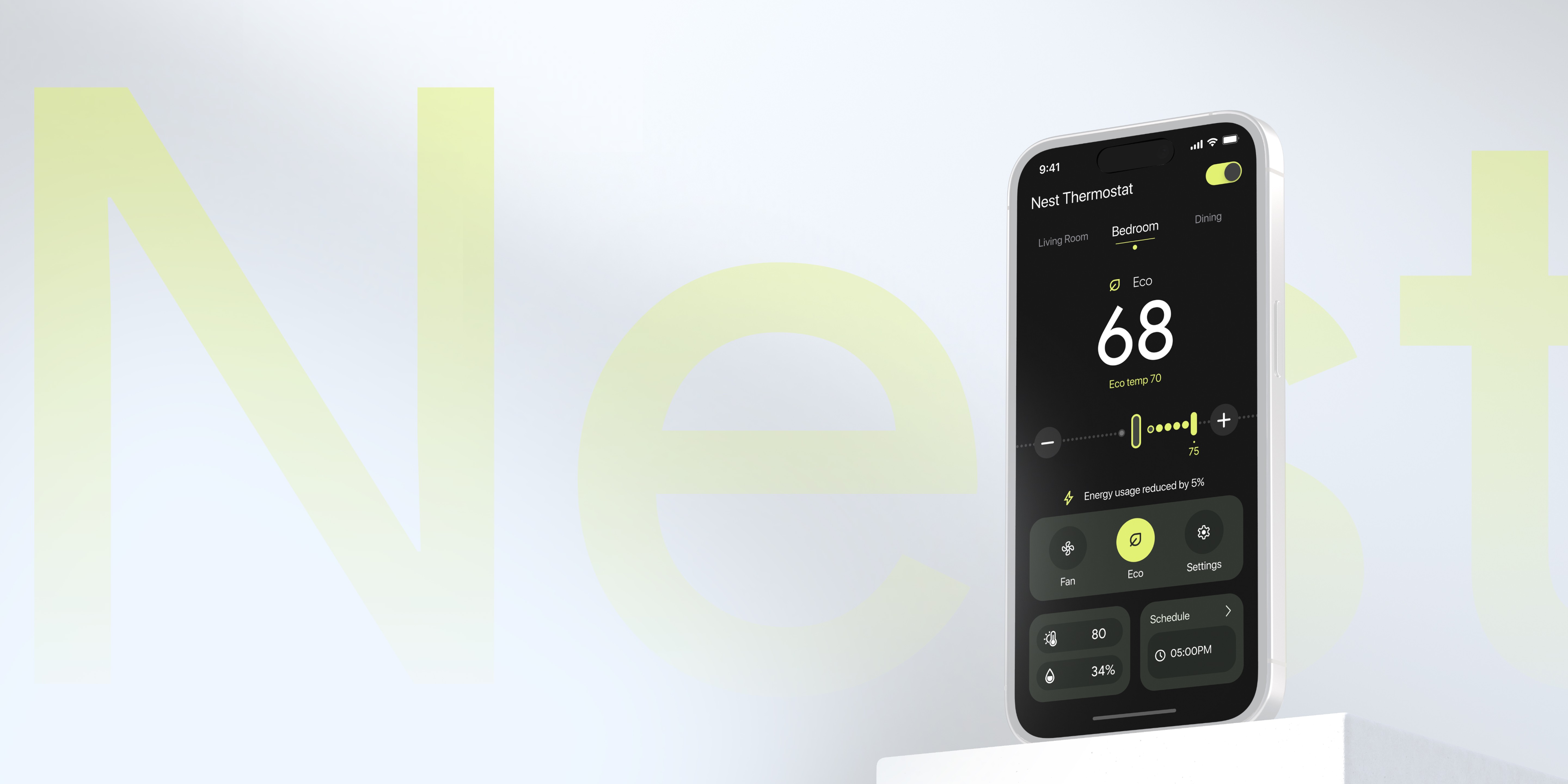
Status Visibility
Through visualized system states and clear text cues, users can easily tell whether ECO mode is active, reducing uncertainty and increasing trust in using the feature.
System Transparency
Visualize the energy-saving logic behind ECO mode so users understand how the system makes decisions, strengthening predictability and trust.
Control Consistency
Optimize the interaction flow across the app and device, providing a consistent control entry point so users can enable ECO mode smoothly across scenarios, improving consistency and engagement.
Comfort Customization
Support user-initiated ECO mode activation while allowing the system to operate within user-defined comfort ranges, balancing energy efficiency and comfort dynamically.
Information Architecture
A more consistent and predictable ECO mode experience through streamlined architecture and unified controls
Centered on the key task flows of ECO mode, we not only restructured the core modules but also optimized related interaction touchpoints. This makes the overall system more consistent and predictable in information display, control entry points, and interaction logic—helping users understand and engage in energy management in a more effortless and proactive way.
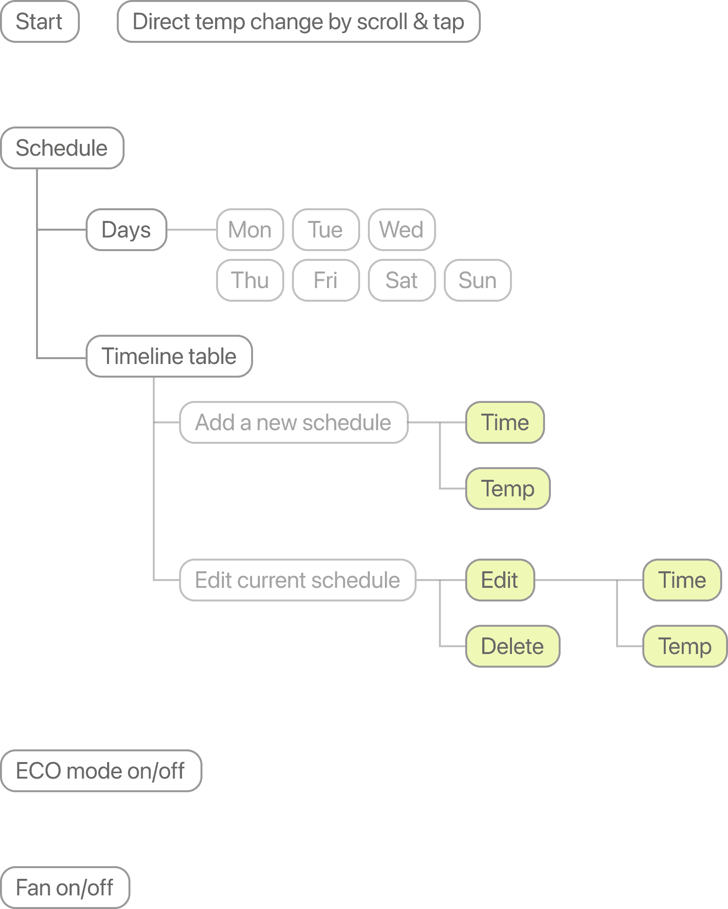
For Thermostat
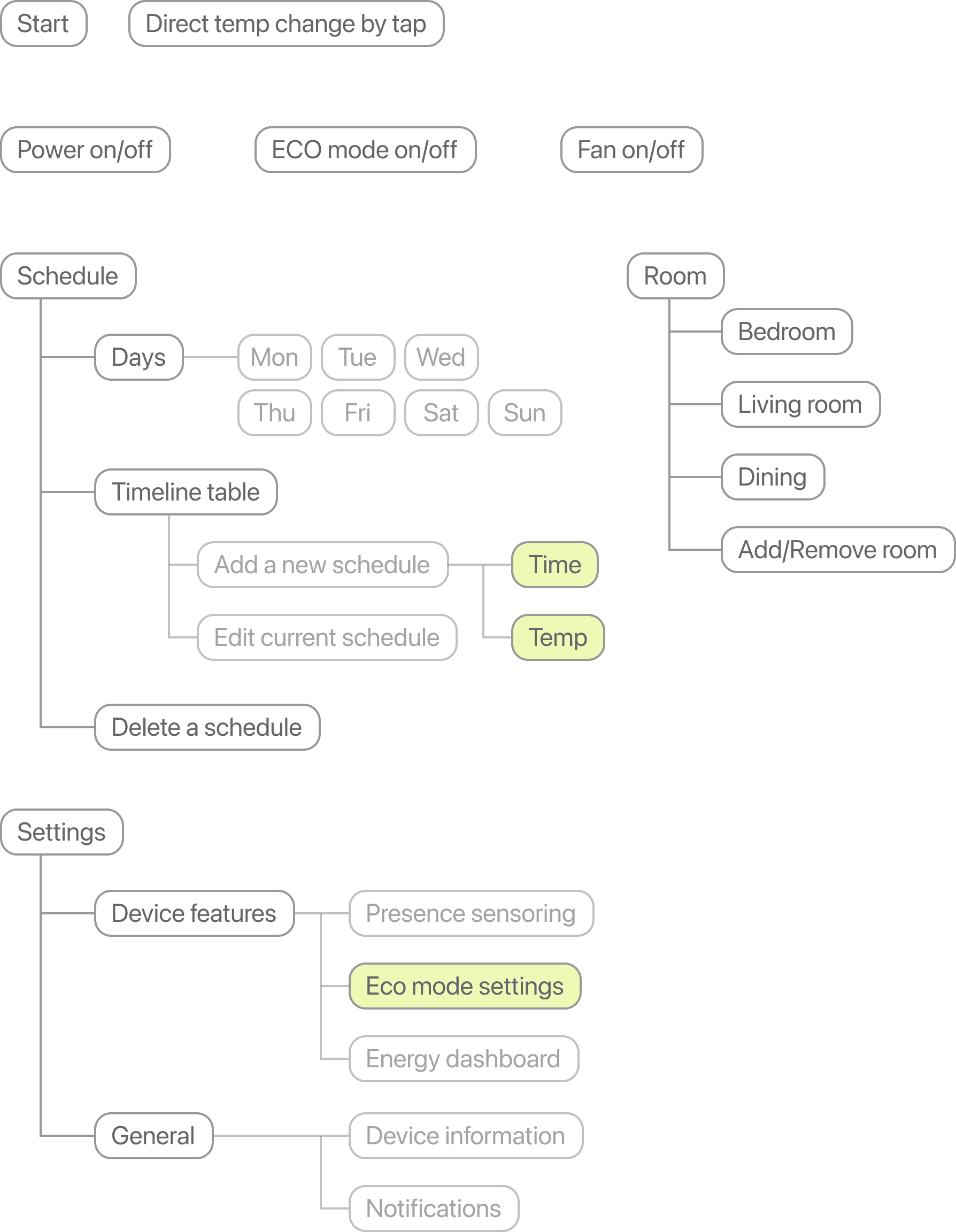
For App
Low-Fidelity Wireframes
Unifies thermostat and app workflows through validated task flows
Building on the optimized information architecture, we created low-fidelity wireframes for both the thermostat and the app to further validate the structure and task flows. By simulating screen-to-screen connections and key interaction points, we identified potential issues and aligned interaction logic across the experience.
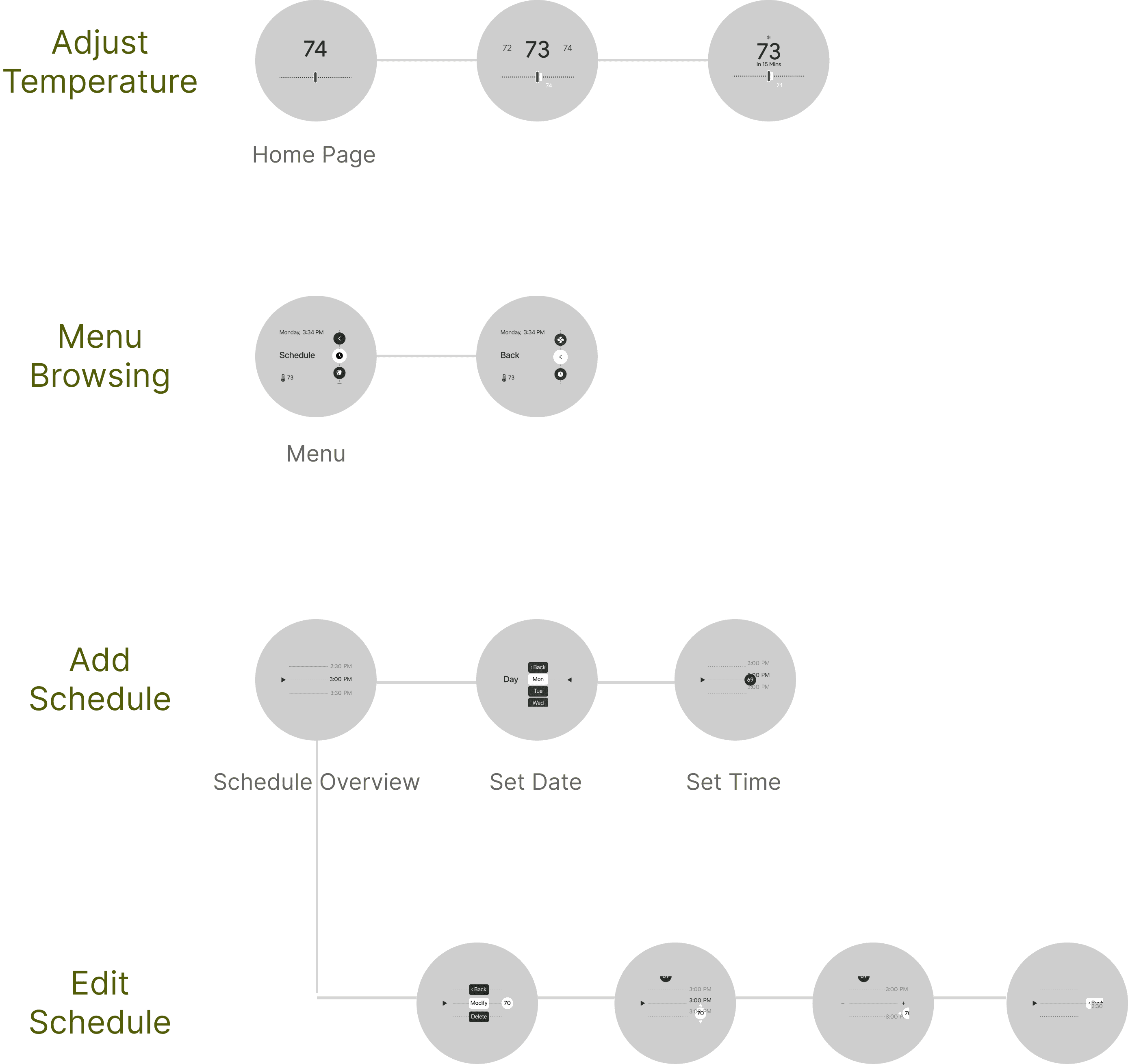
For Thermostat
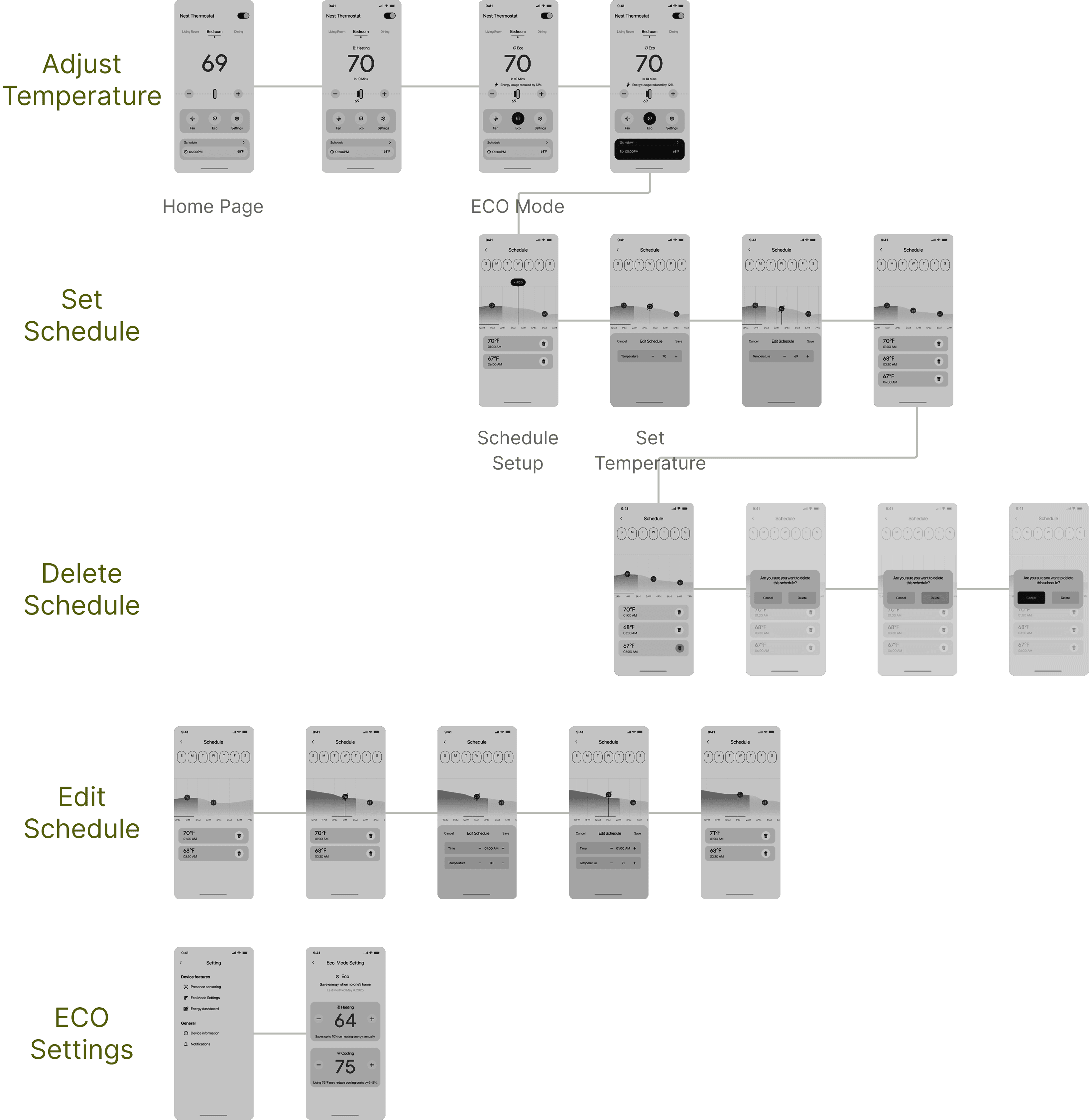
For App
User Testing
The current workflow suffers from friction, unclear navigation, low ECO mode clarity, and inconsistent cross-device interactions
Building on the wireframes, we tested key user flows across the thermostat and app using usability testing, behavioral observation, and follow-up interviews to capture behavioral patterns and pain points.
The insights were grouped into four recurring themes: workflow friction, unclear navigation, low ECO mode clarity, and inconsistent cross-device interactions.
These insights directly shaped our optimization priorities: smoothing key task flows, clarifying wayfinding, strengthening contextual feedback, and aligning the thermostat and app experience.
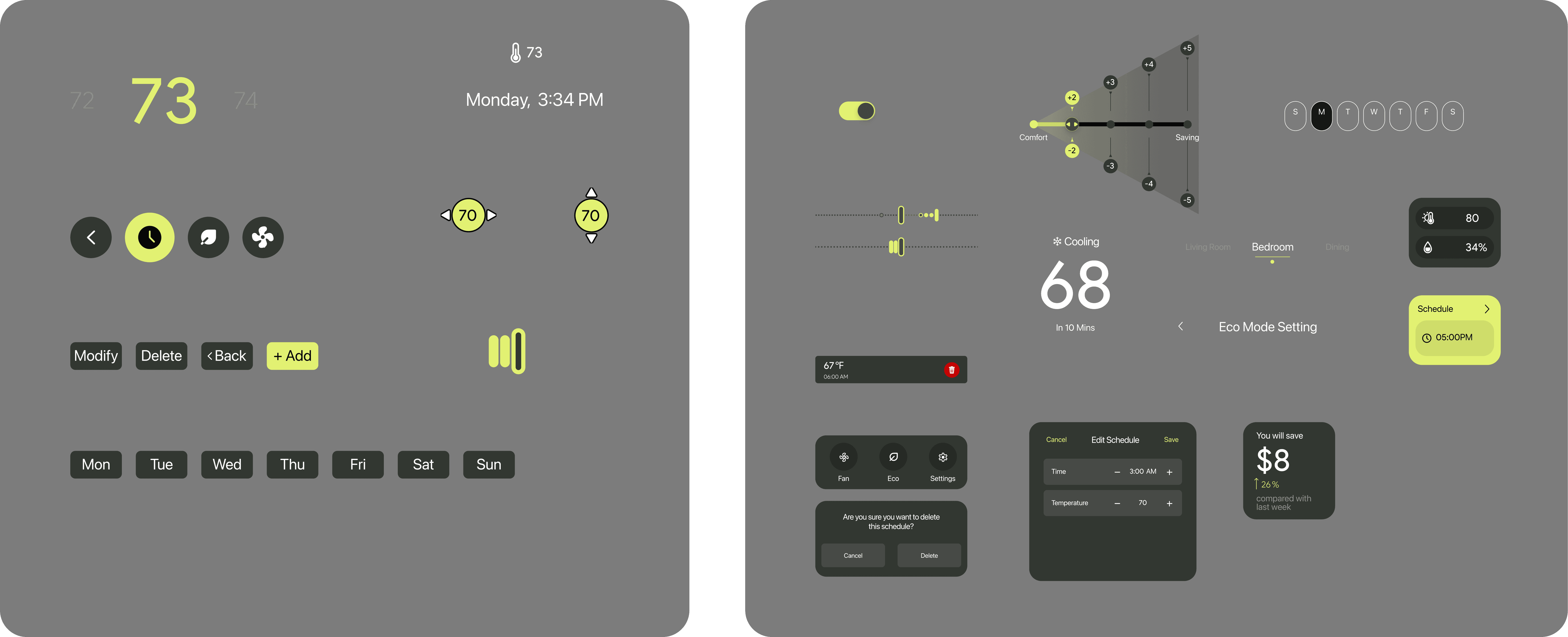
Improvement 01
Home Page
Creators often face complex, unstructured listing flows, causing friction, reducing motivation, and driving them away from online selling despite their potential.
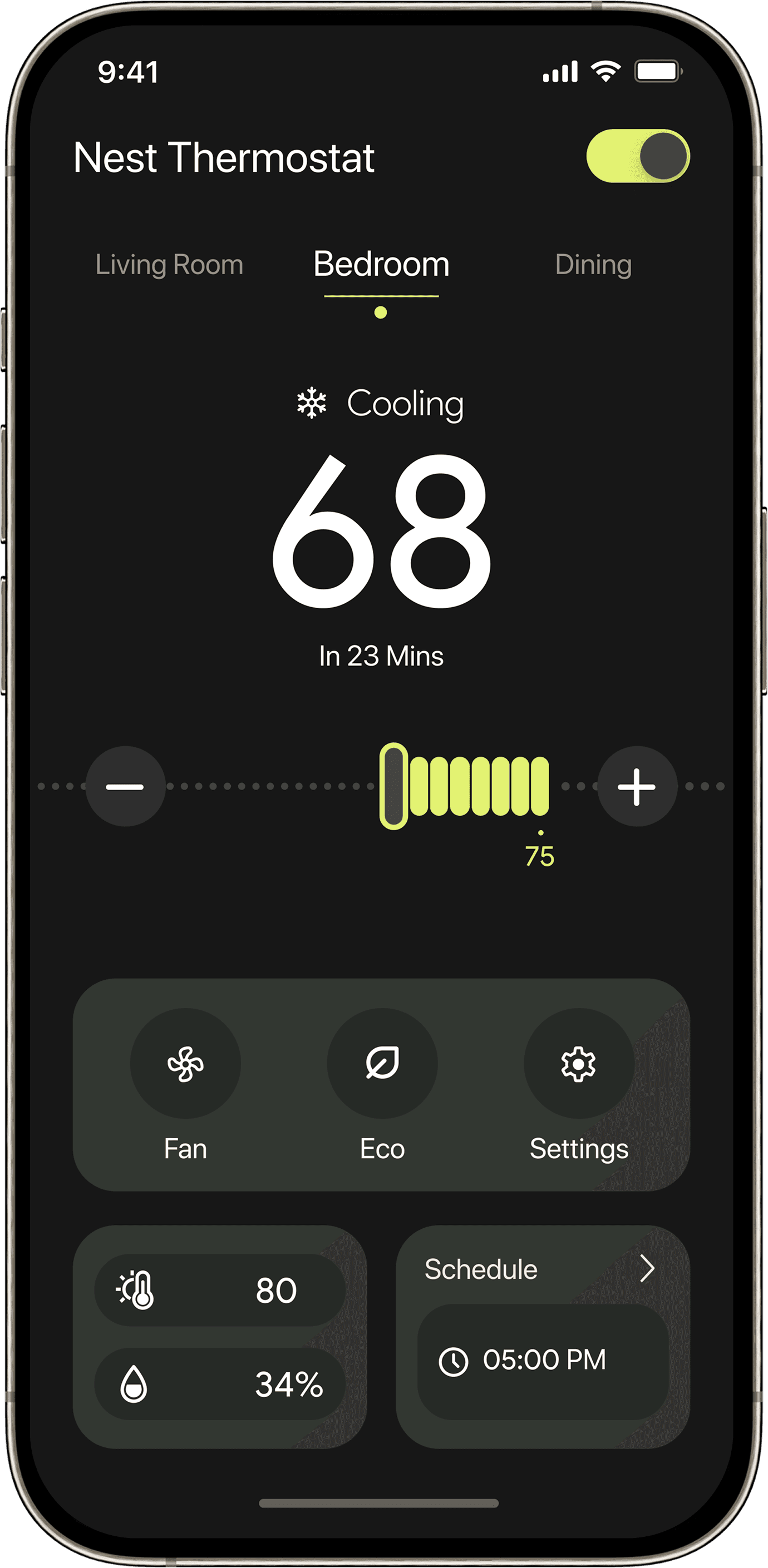
Normal Mode
The temperature slider spans the full adjustable range.
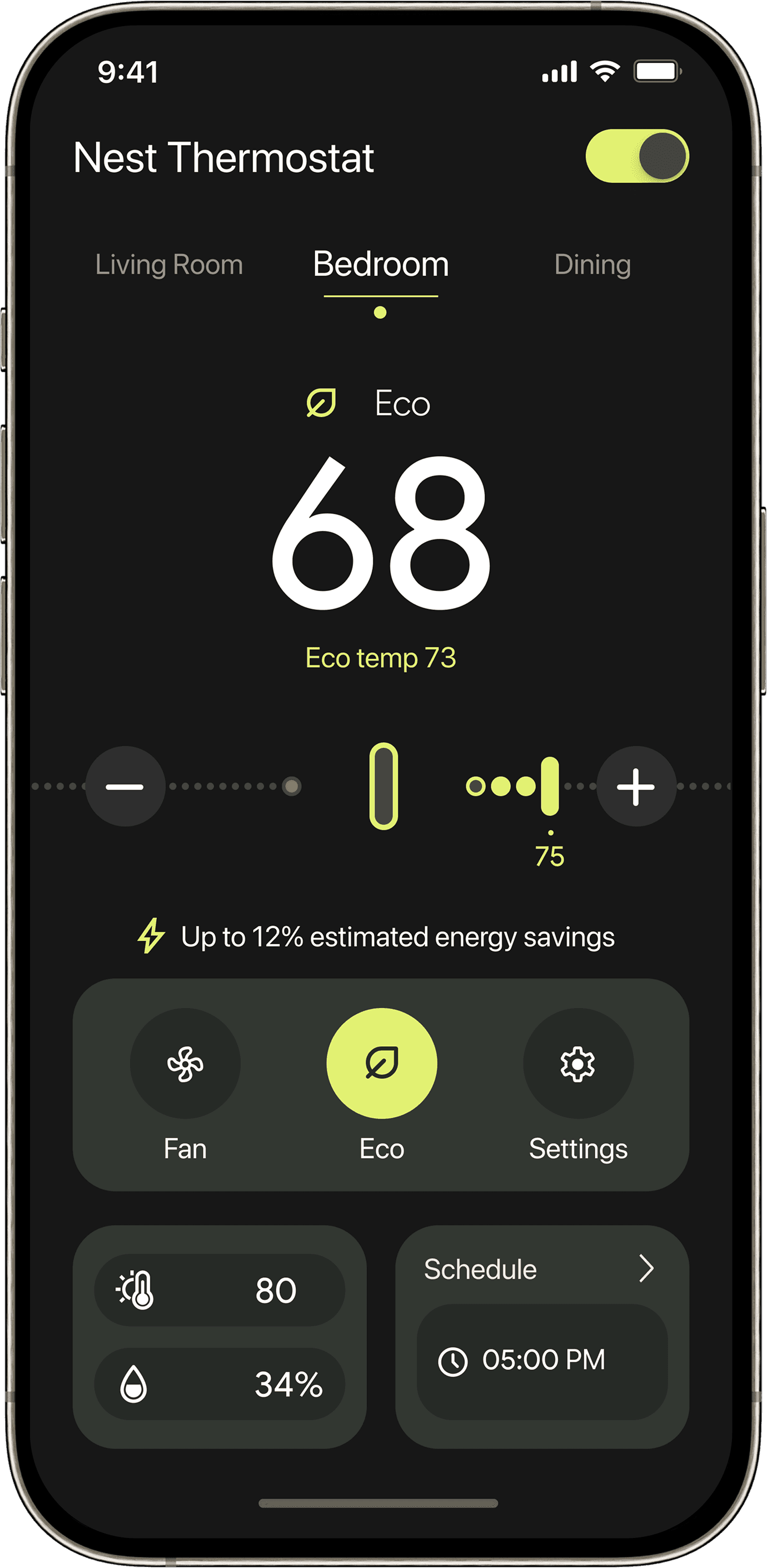
ECO Mode
In ECO mode, the slider only extends to the “Eco temp” range.
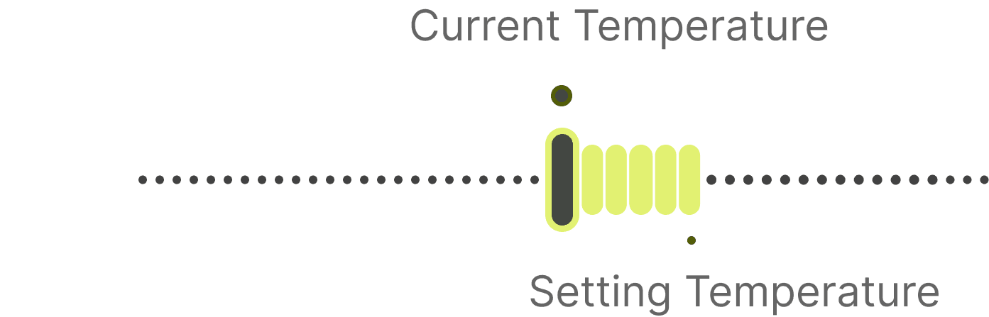
Slider Bar
By displaying both the current and target temperatures as dual points, along with dynamic progress-bar feedback, the design clearly visualizes the temperature gap and adjustment range—enhancing users’ awareness and sense of control during temperature tuning.
Improvement 02
Editing ECO Mode
Creators often face complex, unstructured listing flows, causing friction, reducing motivation, and driving them away from online selling despite their potential.
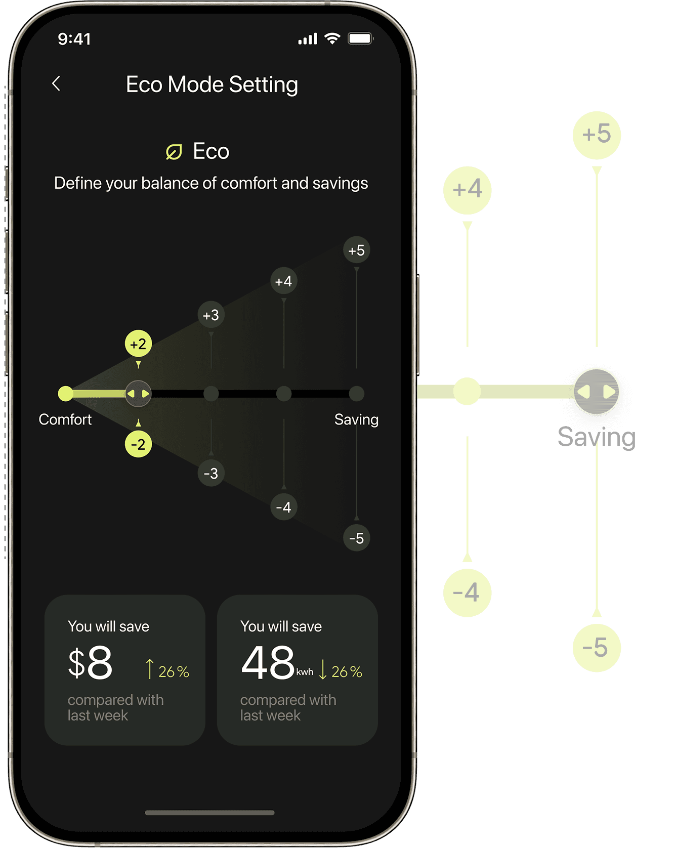
In ECO advanced settings, users can fine-tune temperature flexibility through a “Comfort–Efficiency” control. For example, setting ±2°C keeps adjustments within a narrow range around the target temperature to prioritize comfort, while ±5°C allows a wider range for greater energy savings. This gives users control over how aggressively ECO mode optimizes, improving both usability and confidence in energy-saving behavior.
The interface links user actions with estimated savings in real time, making the impact of ECO mode visible and easy to understand—improving transparency and reinforcing trust in energy-saving outcomes.
Improvement 03
Adding a Schedule
App
The scheduling feature was expanded to support Eco mode, allowing users to manually enable energy-saving mode or incorporate it into their daily schedules for more strategic energy management.
Thermostat
The thermostat continues the app’s overall design language, achieving a consistent system across visual identity and interaction logic. Elements such as Eco mode–specific icons and the circular control layout align with the app, reducing cross-device learning effort.
Improvement 04
Modifying a Schedule
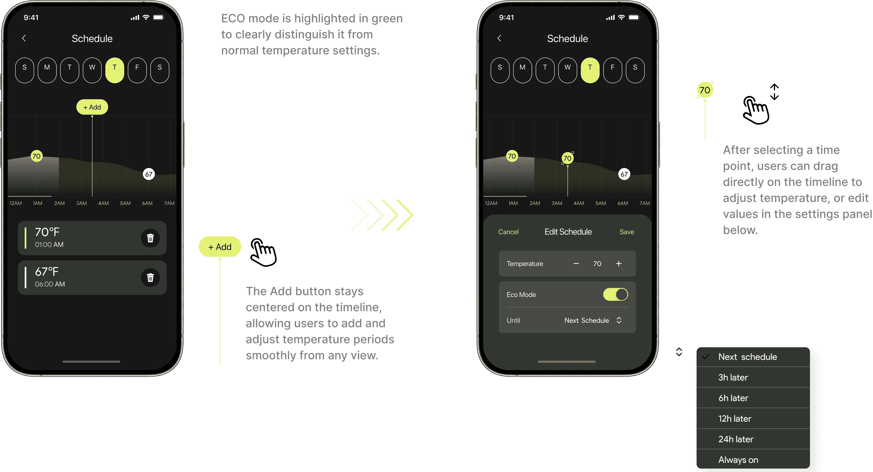
App
Modifying a Schedule allows users to easily adjust planned temperature points through an intuitive, graph-based interface.
On the app, selecting a schedule point auto-focuses and centers it for quick, precise edits. Time, temperature, and ECO mode settings are consolidated into one editing panel, reducing mis-taps and enabling smoother adjustments.
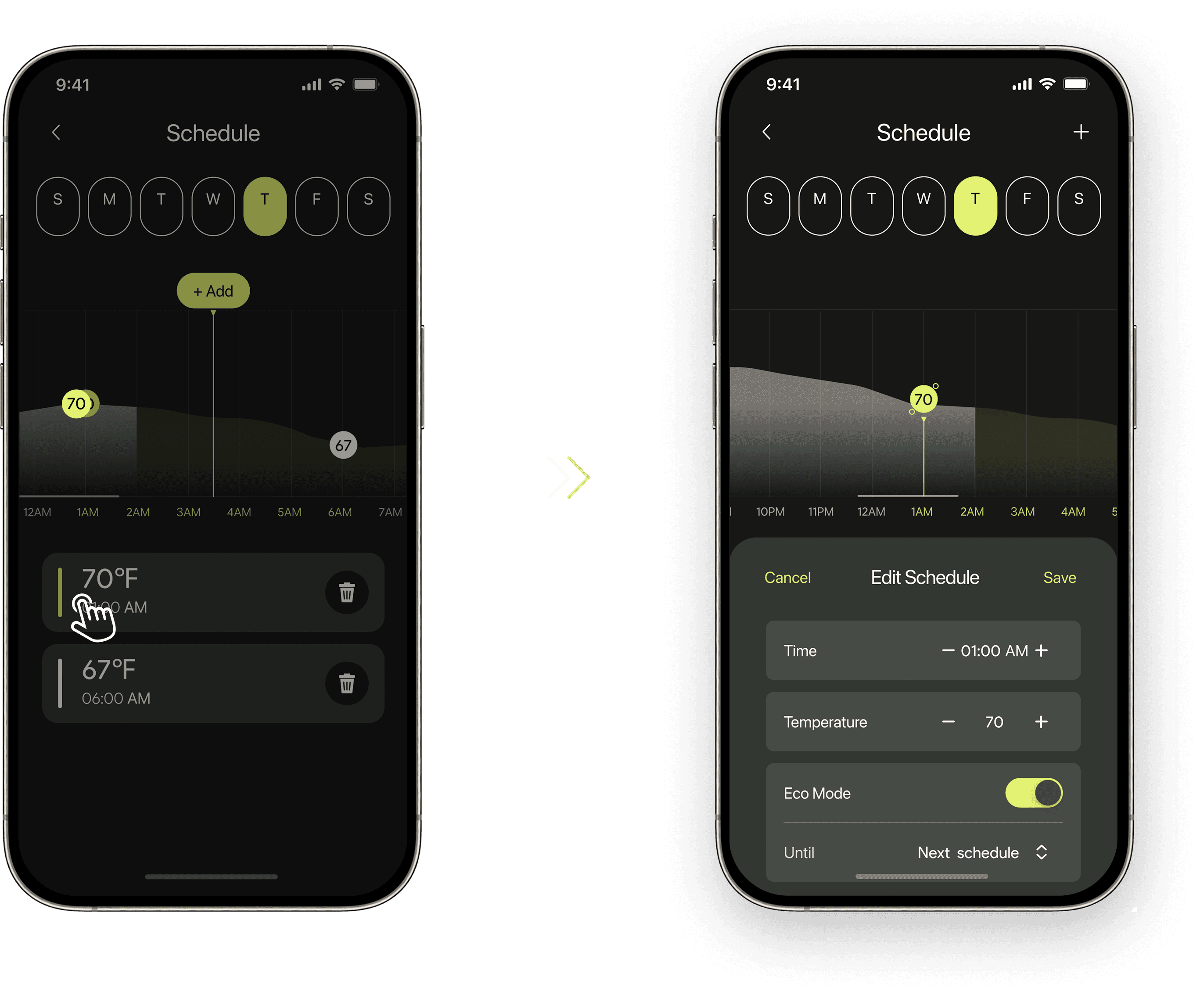
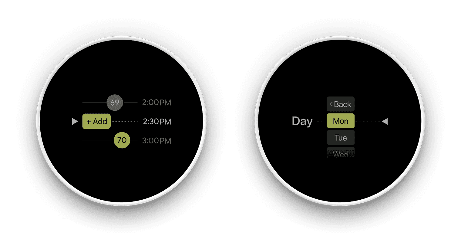
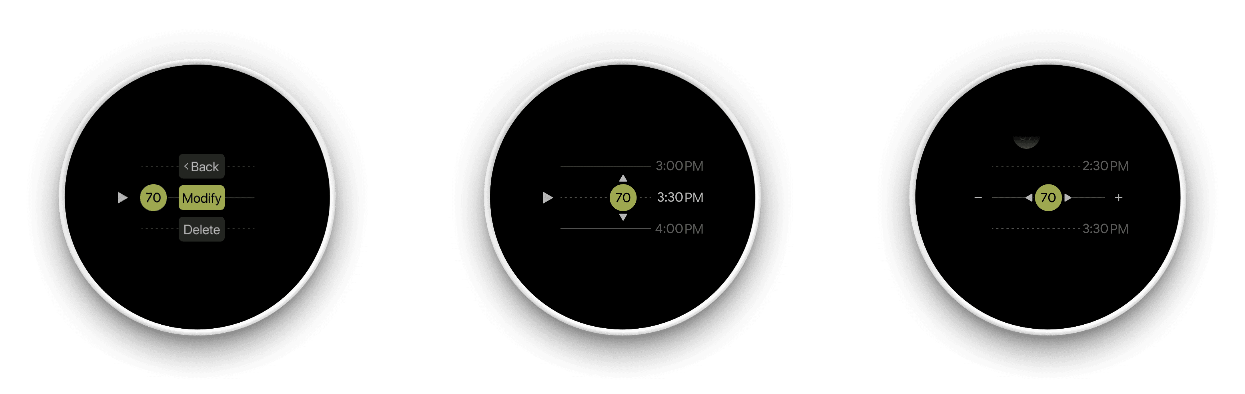
Thermostat
Through the use of a “dot + central axis” visual system, the thermostat scheduling experience maintains strong visual continuity. Whether at the entry point or within detailed time and temperature adjustment views, core interactions are organized around the central axis, with the dot consistently retained as a temperature node that serves multiple roles including interaction focus, time reference, and mode indication.
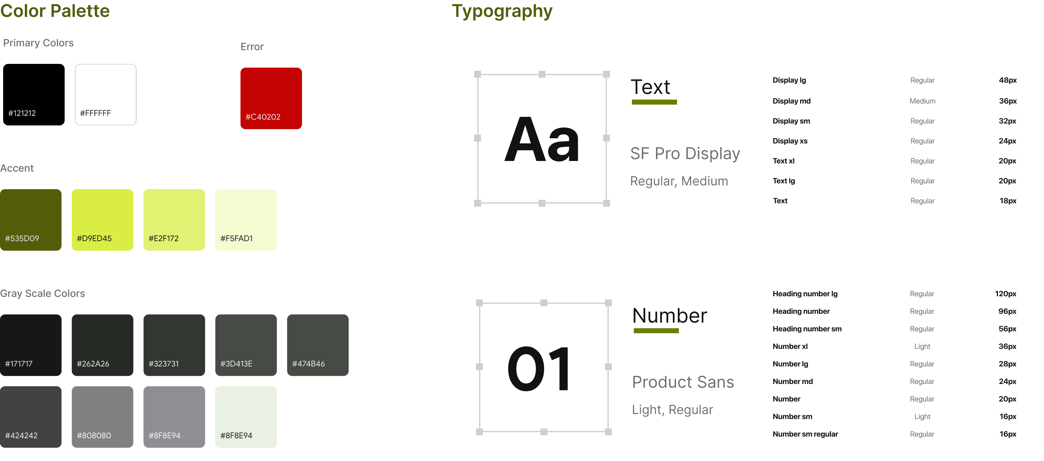
Style Guides
Define visual languages
This style guide defines visual standards for layout, color, and typography to ensure a consistent interface experience.
Spacing Guidelines
Card padding on both left and right sides: 24pt. Spacing between modules follows a 4pt increment system, with common values including 8pt, 12pt, 16pt, and 20pt.
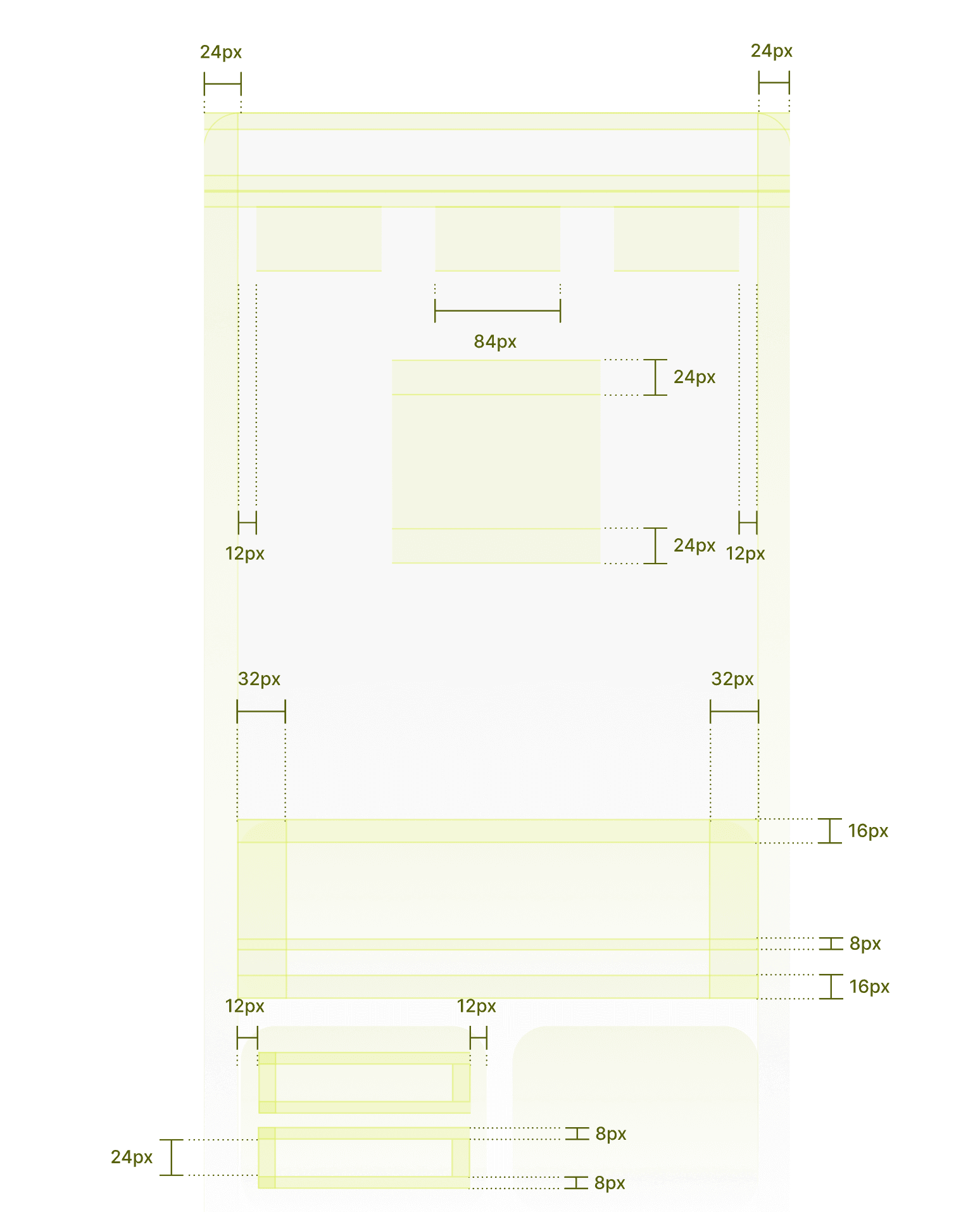
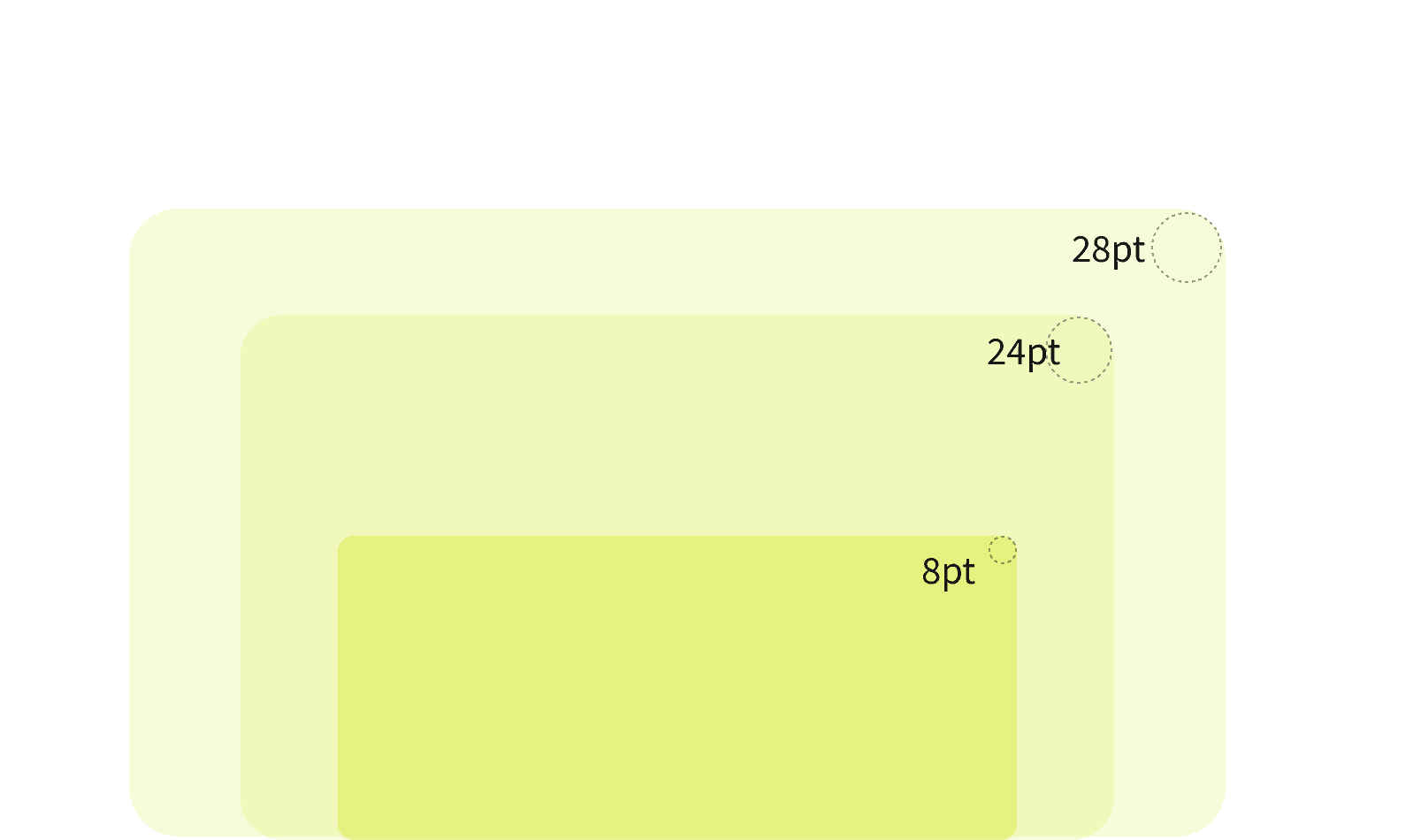
Corner Radius Guidelines
To maintain visual consistency, card corner radii use even-number values and scale down based on card size. Common values include 28pt, 24pt, and 8pt.
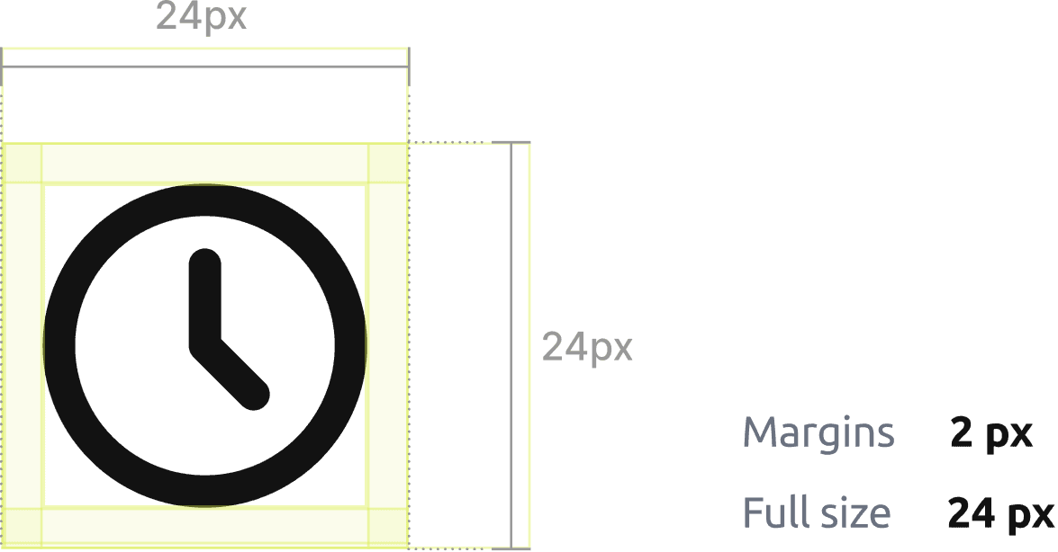
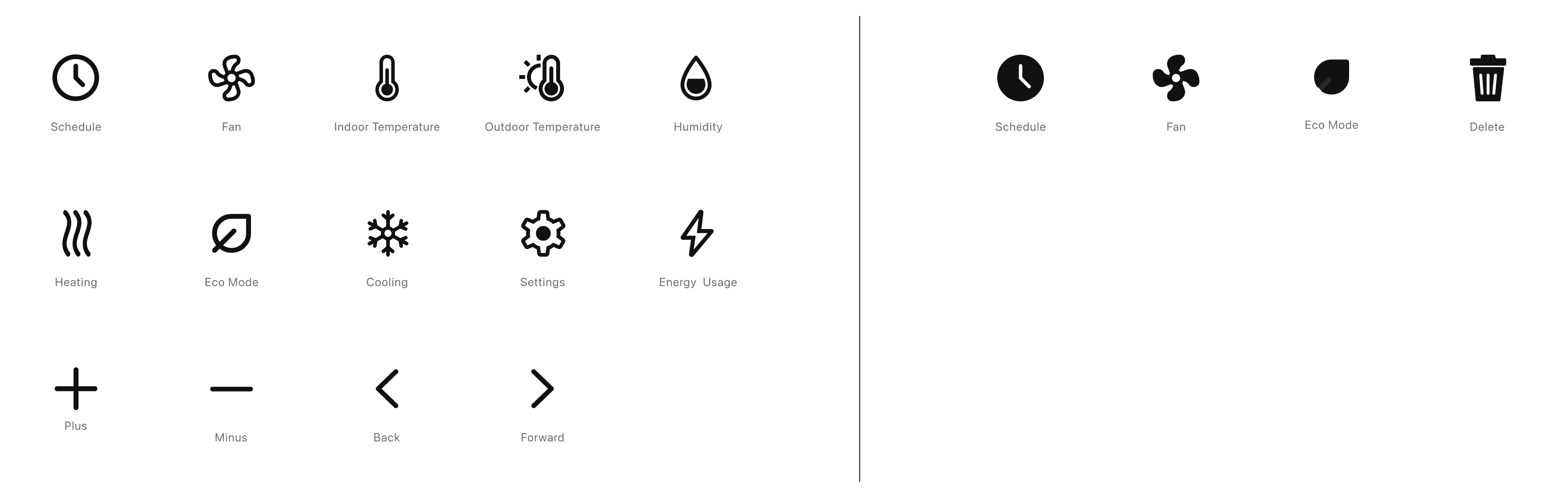
Icon
To ensure consistent interaction between mobile and device interfaces, we have standardized the icons.
Design System
Components
To ensure interaction consistency across mobile and device interfaces, we standardized the minimum hit area for icons and button components:
All tappable elements must have a touch target of at least 44×44 pt
Minimum icon size: 24×24 pt
Hit area (touch target): ≥ 44×44 pt